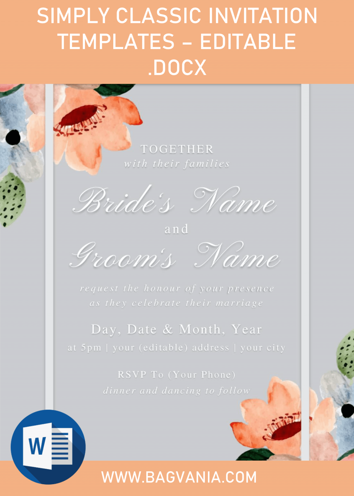
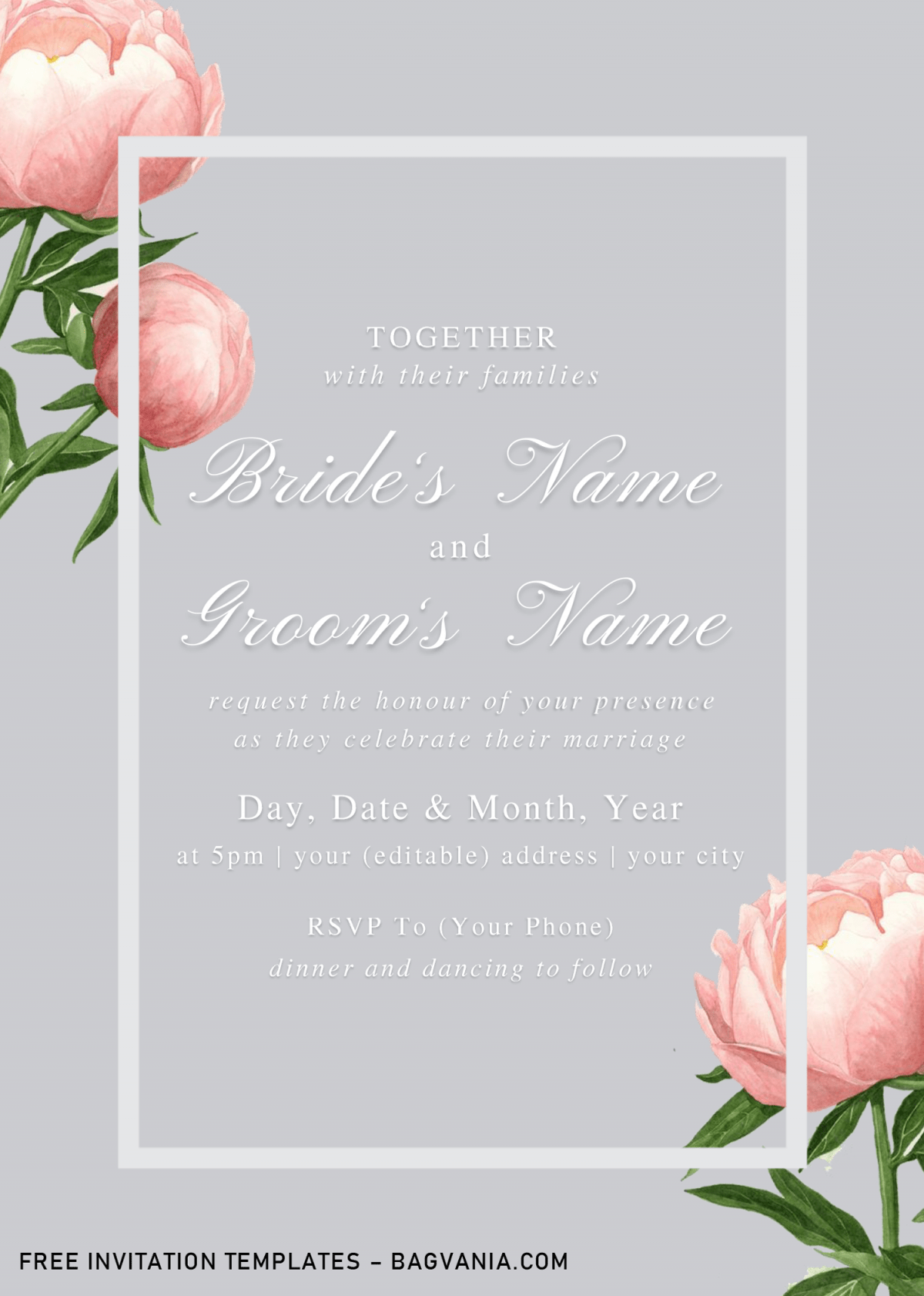
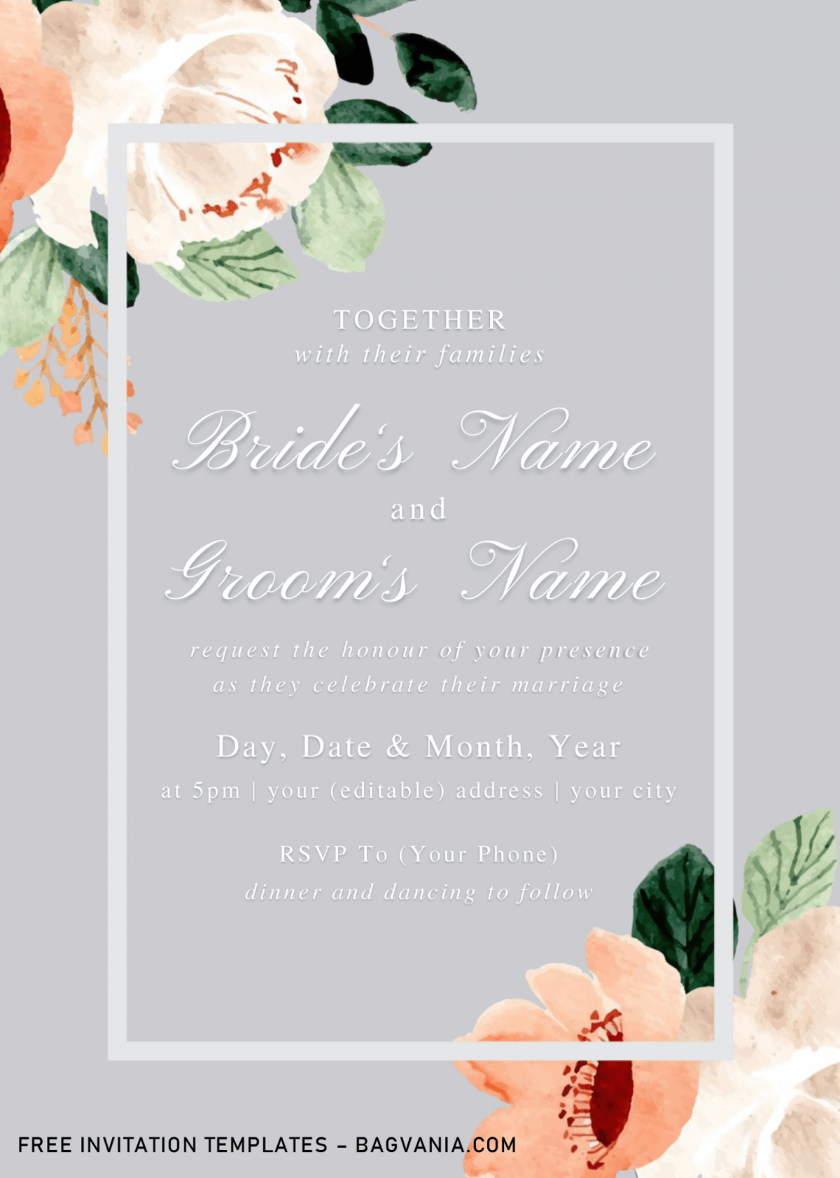
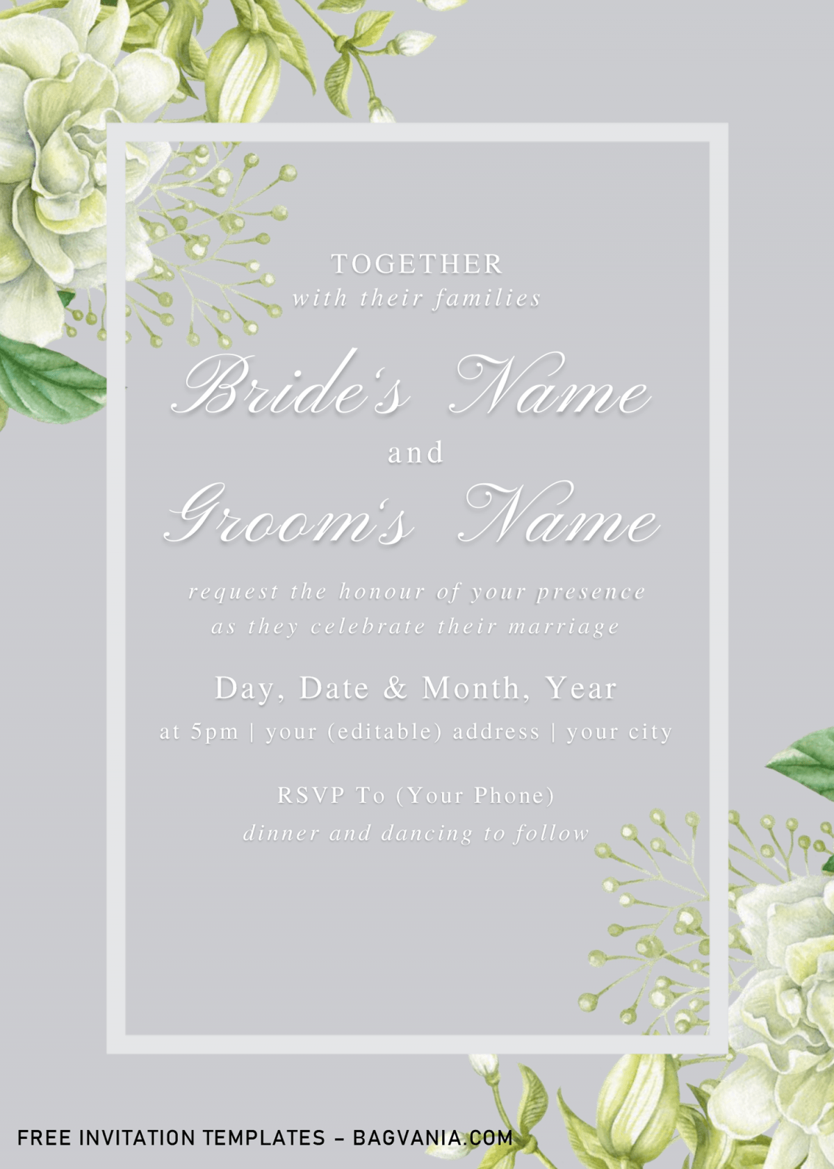
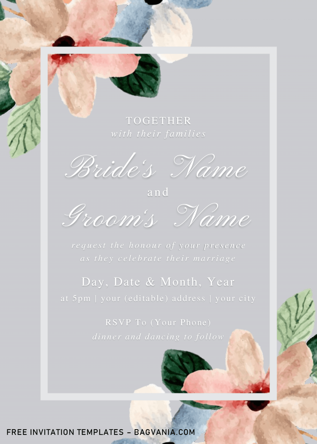
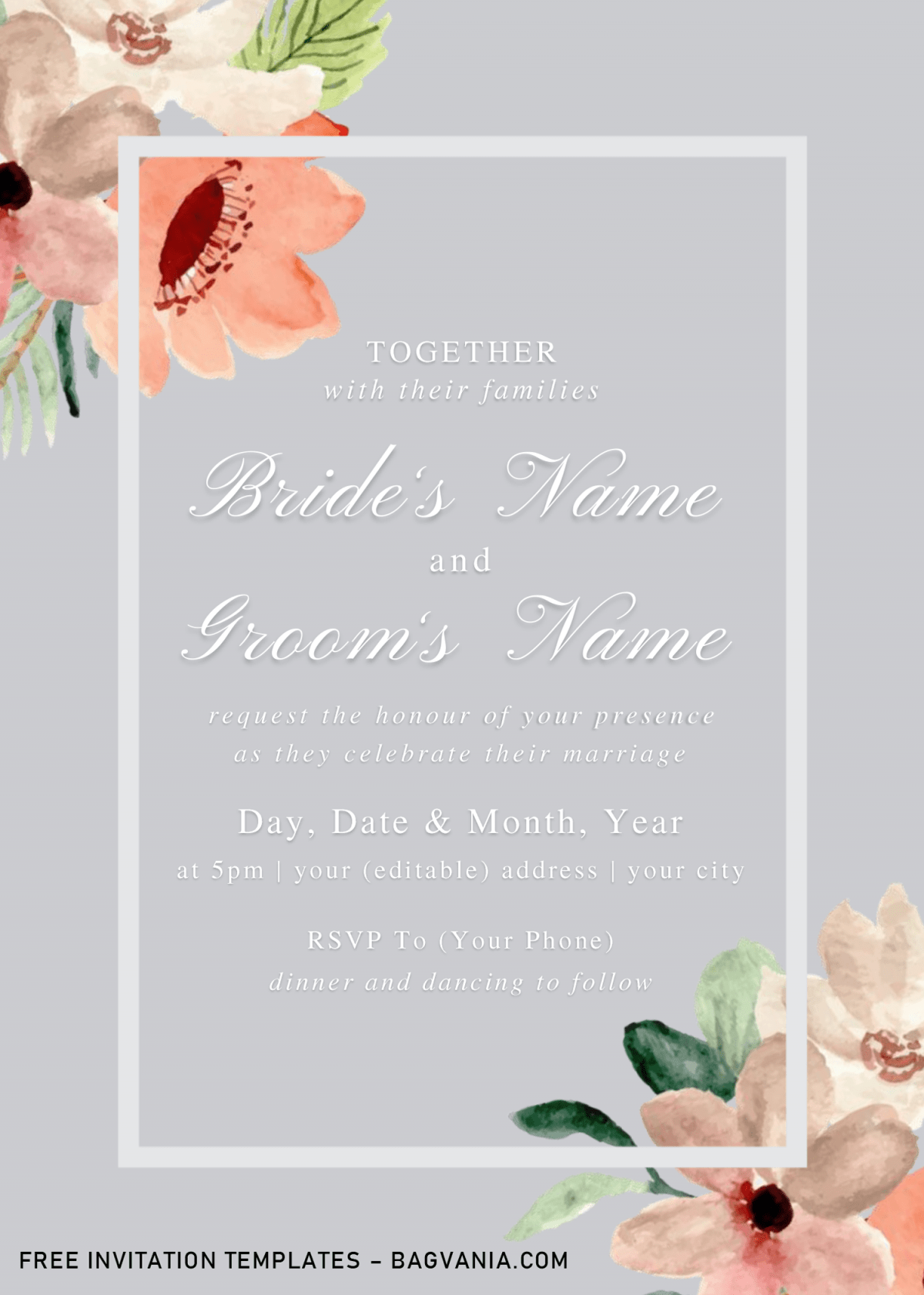
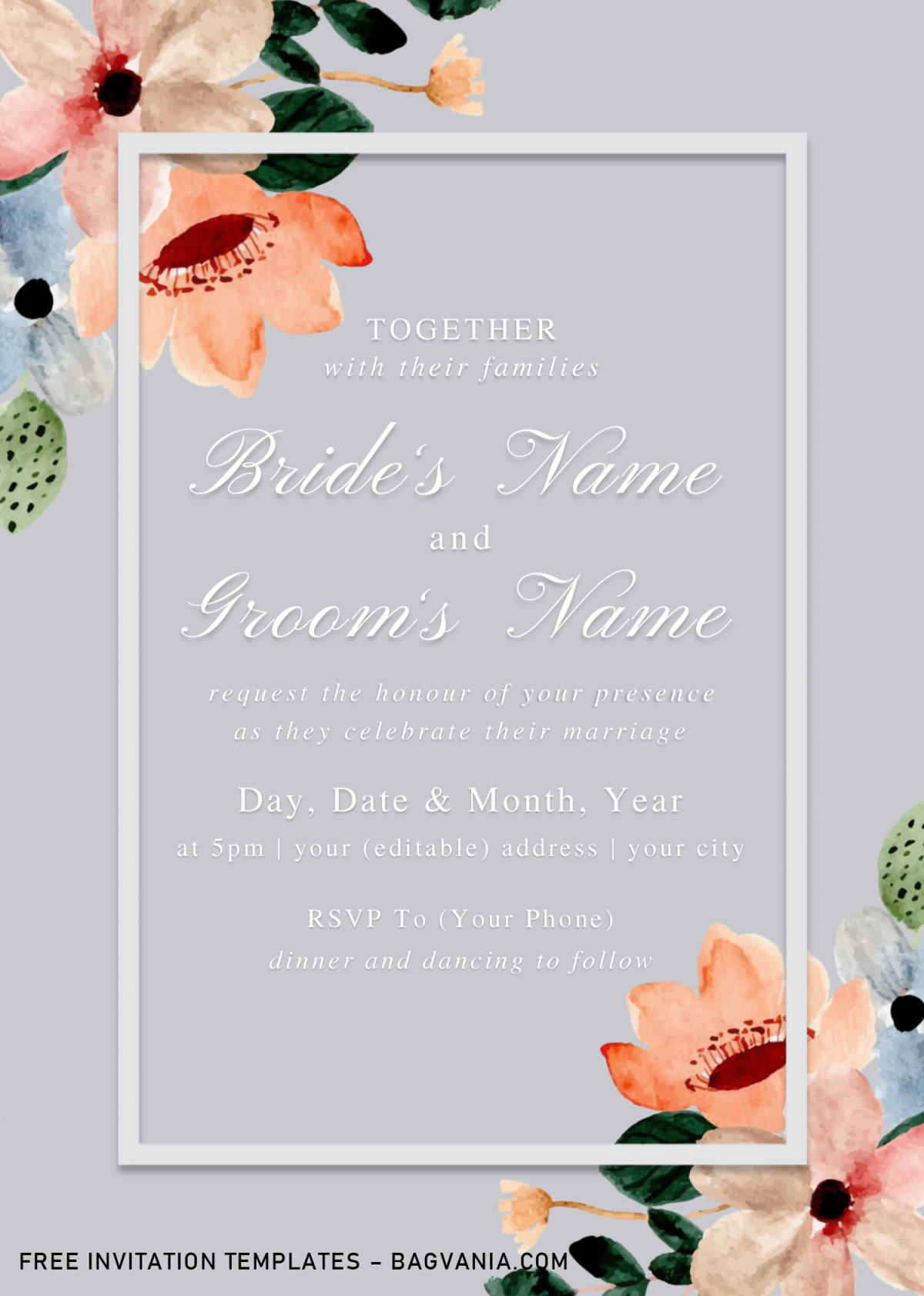
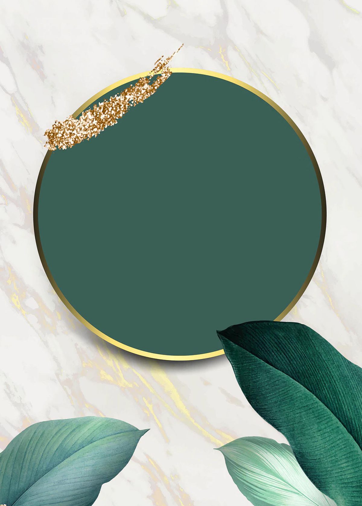
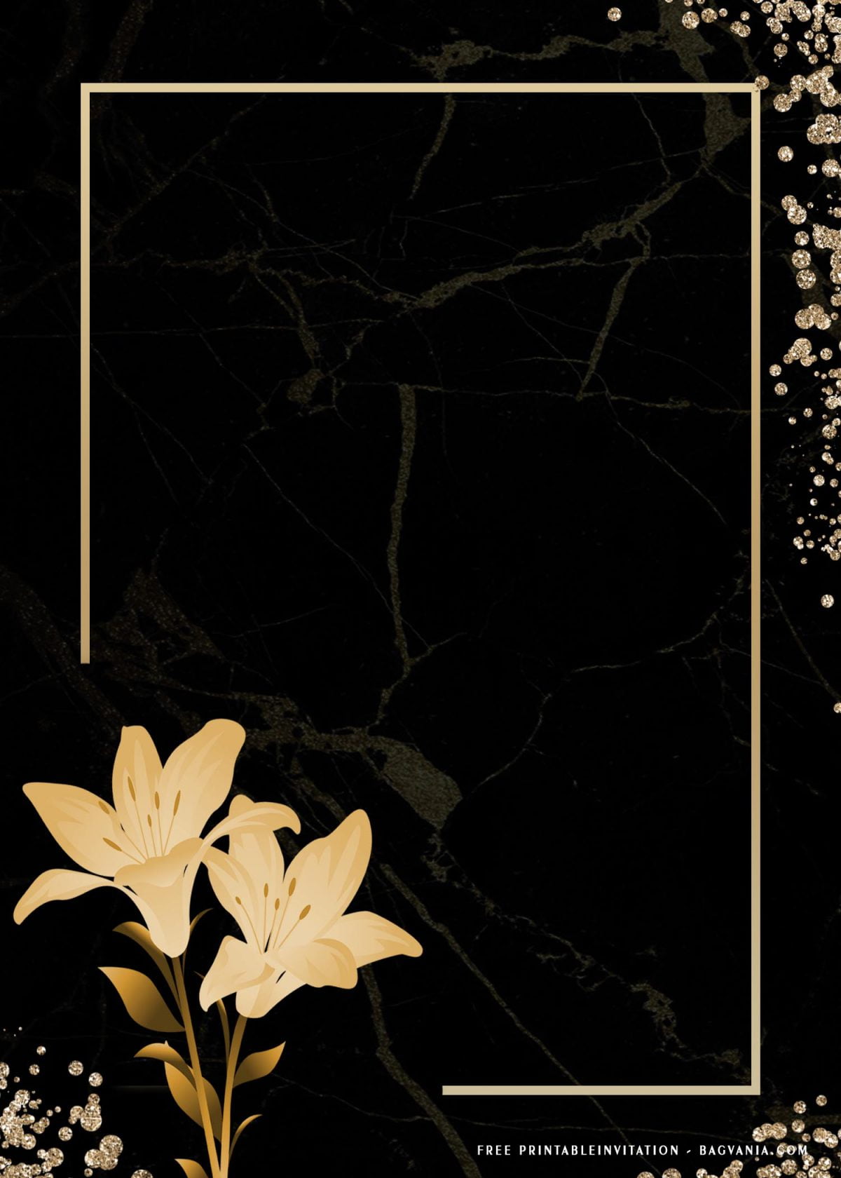
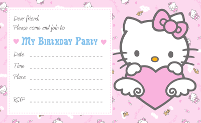
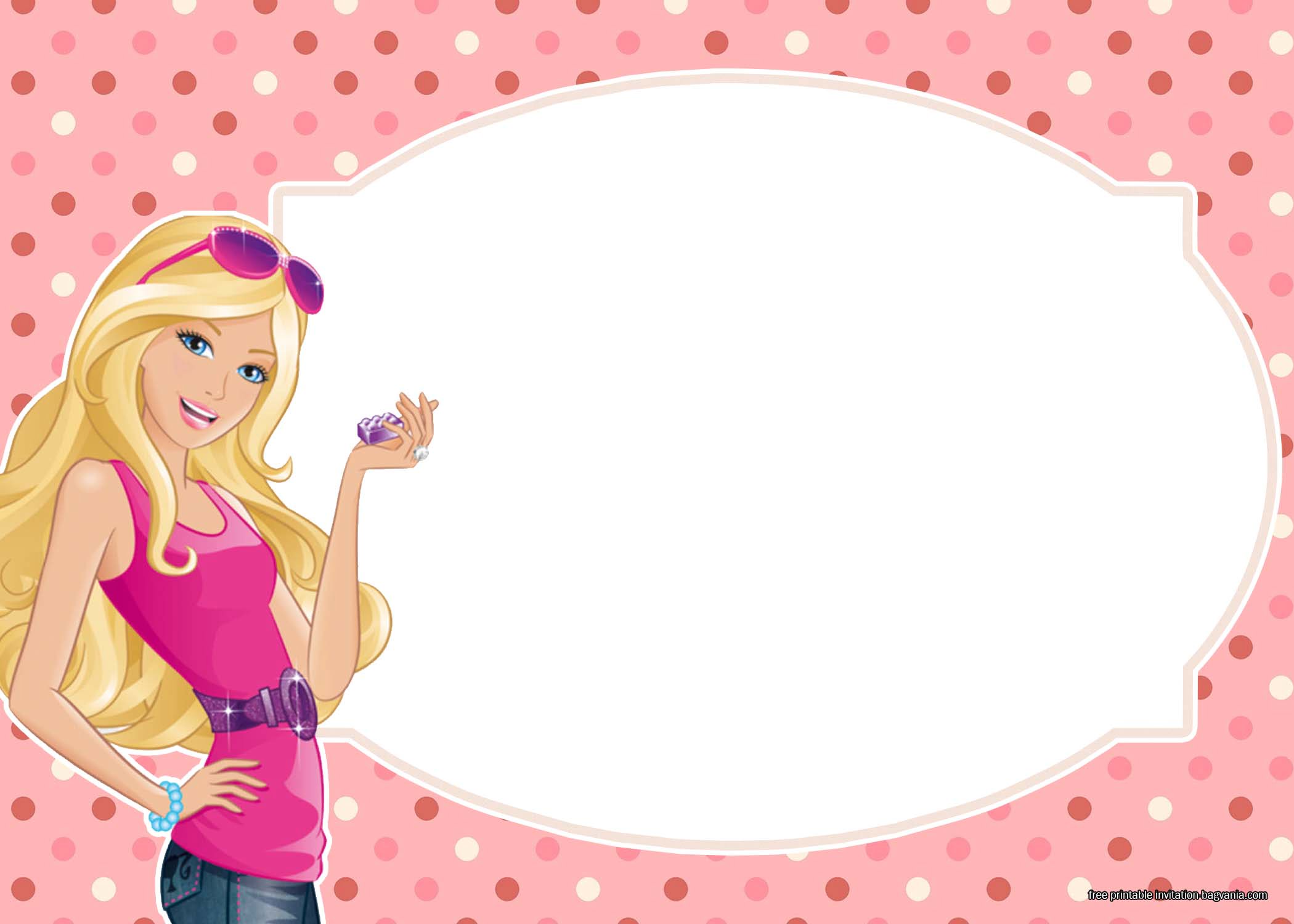
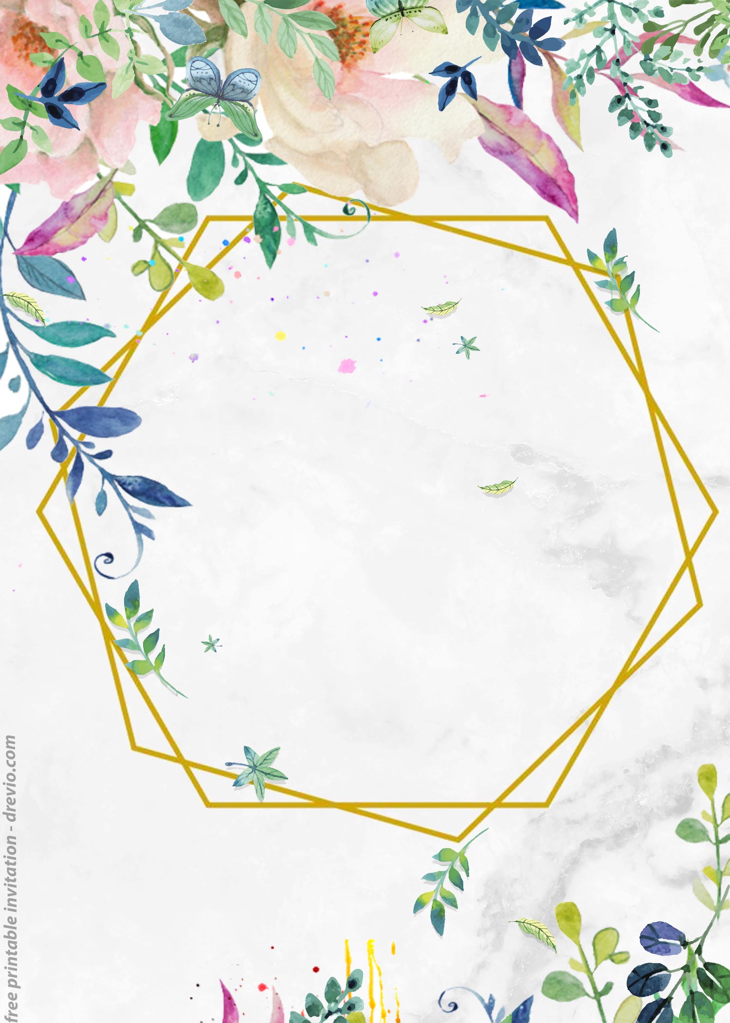
The truth behind Simple is Best is not just taking everything aside and placing the “right” number of elements into your designs, but you also need to think the main part, such as Bold, Minimalist and Meaning behind it. Let’s take a look at these, these following invitation card is a perfect example for “Simple is best”,
According to Google, I found that the color and complexity of design really makes pretty much different result and more appealing to the audience, which in this case is all of our party guests. Thus, the reason why I made this invitation card with Minimal as the major element of it.
You probably won’t see something like these, each card will allure your guests to give more attention to the design as well as read your party information. Definitely not an easy job to do, but yeah, I made it for you. This Simply Classic invitation card comes in portrait orientation (5×7), it has Muted or Soft Color background, and matching2x; Light Ash gray text frame. In between of those frame and background, you will get Floral graphics or elements, Watercolor Floral (Roses, Tulips & Hibiscus).
Aside from all the decoration elements, you also got a great feature, which is, our template is editable, no advanced or mastery skills required to do it, as it’s editable with Microsoft Word.
Download Information
- All templates and materials were stored in our Google drive, and to gain access of it, you need to click the download link that we’ve provided and placed it above.
- That link and file are 100% safe from virus, so no-need to worry about that.
- To download the file, as you can see, there is another, download button and Drop-down arrow, click one of them to download our templates.
What should you do next?
- There are a couple of files inside Fonts folder, install all of them.
- Then open template you’d like to use with Microsoft Word 2007 (At least) or above.
- Print the template on any printing paper, it could be cardstock, cotton, linen, or even standard text paper.
